Weekly retrospective #27: BURLESQUE UPDATE!
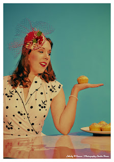
Just found the time to edit three more images from the workshop with Melody D'Amour. And there are still some nice other shots in the works! But for now three new ones.
Instead of using the files as they are, I wanted to mimik the mid 50's look the American ads have had. Whether they used illutrations or photos in the good old times the images mostly tend to have strong colors with nice gradients, yellowish skin tint and strikingly bold color areas.
As I'm no real friend of Lightroom I brought the images into PS and edited them in TOPAZ, Exposure and sometimes with CameraBag. Maybe not the final words about the correct vintage style, but most "test viewers" have been happy with that.
As told before, more images to come. Enjoy!


Kommentare
Kommentar veröffentlichen